What a Century of Yield Spikes Says

September's bond selloff was fast, but not rare. History says what followed depended on why yields rose and what investors had paid.
In September the 10-year Treasury yield rose more than half a percentage point, to 5.29%, and the Federal Reserve raised rates for the first time since 2023. Stocks barely reacted.
| September 2026 | What happened |
|---|---|
| 10-year Treasury yield | 4.75% → 5.29%, the highest since 2002 |
| Federal Reserve | First rate increase since 2023 |
| S&P 500 | Roughly flat |
| Stock-market volatility (VIX) | Calm, ending near 16 |
| Bond-market volatility (MOVE) | Up nearly half |
The last time a 10-year Treasury paid this much, I had not yet opened my first brokerage account. That came a year later, in Seattle.
The question investors ask after a month like this is a fair one: is this the kind of move that comes before trouble? We looked at a century of data to see what it can and cannot tell us.
Fast, but not rare
A jump of this size is not unusual. Measured against what was normal for its time, the 10-year has had a sharp spike roughly every two years for a century. The half-point moves that make headlines clustered in the inflationary 1980s.
| Decade | Half-point monthly rises | Rises large for their time |
|---|---|---|
| 1920s¹ | – | ■■■ 3 |
| 1930s | – | ■■■■■ 5 |
| 1940s² | – | ■ 1 |
| 1950s | – | ■■■■■■■■ 8 |
| 1960s³ | ■■ 2 | ■■■■■■■■■■ 10 |
| 1970s | ■■■■■ 5 | ■■■■ 4 |
| 1980s | ■■■■■■■■■■■■■■■■■■■ 19 | ■■ 2 |
| 1990s | ■■■■■■ 6 | ■■■ 3 |
| 2000s | ■■■■■ 5 | ■■■■ 4 |
| 2010s | ■ 1 | ■■ 2 |
| 2020s⁴ | ■■■■ 4 | ■■■■ 4 |
¹ From 1926. ² Excludes the 1942–1951 wartime cap on yields. ³ Half-point data begin in 1962. ⁴ September 2026 counts in the half-point column. Measured on monthly averages, it falls just short of the second.
What made September unusual was the mix. Nearly all of the rise came from real yields rather than expected inflation. And the Fed turned from cutting to hiking within a year.
What usually happens next
| Since 1962 | After a half-point spike | Any month |
|---|---|---|
| Stocks fell that month | 2 in 3 | 2 in 5 |
| Typical return over the next year | about +10% | about +11% |
Three patterns hold across the modern record.
The month itself usually hurts. By that standard, September was mild.
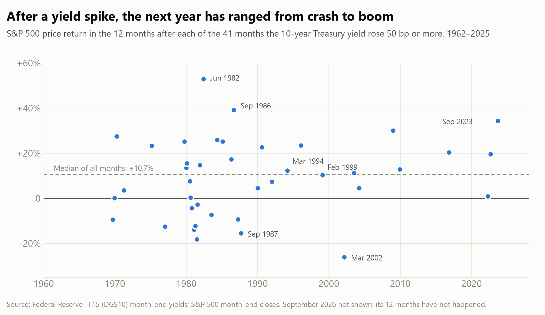
The following year looks ordinary on average, but the range is wide. That held however we measured a spike. The averages hide everything from booms to crashes, as the chart shows.
Whether yields kept climbing depended on the era. When rising yields were bad news for stocks, as they have been recently, the 10-year more often fell back within six months than kept rising. When yields rose with a strengthening economy, they tended to keep going.
Does the starting level matter?
A half-point rise means more when rates start near zero than near five percent. So we measured spikes a second way, as a share of the starting yield. The list of big months changed almost completely.
| How we measured a spike | Months mostly from | Typical starting yield | Stocks that month | Yields six months later |
|---|---|---|---|---|
| Half a point or more | 1970s–80s | about 7.4% | usually down | more often lower |
| A tenth of the starting yield or more | 2010s–20s | about 2.4% | about even | more often higher |
| Both, like September | every decade since 1970 | about 4.1% | usually down | more often lower |
The averages changed mostly because the era changed. Within the same kind of era, the two measures told the same story. September qualifies under both, and the months that share its profile look like the half-point record.
A century of context
The century is not one market. From World War II until 1951 the Fed held long-term yields down to help finance the war, and they barely moved. Outside that period, what a spike meant for stocks changed with why yields were rising.
| Period | What usually drove spikes | When yields rose, stocks tended to | Year after a spike vs. a normal year |
|---|---|---|---|
| 1926–1961 | Depression, war, gold-standard crises | fall slightly | usually a loss: about −2% vs. +10% |
| 1962–1999 | Inflation and Fed tightening | fall | weaker: about +9% vs. +14% |
| 2000–2019 | Mostly economic growth | rise | a little weaker: about +9% vs. +11% |
| 2020–today | Inflation and Fed tightening | fall | a little weaker: about +15% vs. +18% |
Typical (median) total returns. The last two rows rest on only six and four spikes.
The penalty has narrowed since 2000, but it has not disappeared. And since 2020 the older relationship has returned: rising yields have more often meant falling stocks. September belongs to that older pattern.
What separated the bad years
In 1999 Warren Buffett wrote that interest rates “act on financial valuations the way gravity acts on matter.” He wrote it in the only other period when stocks were as richly valued as they are today.
Gravity pulls hardest when bonds pay nearly as much as stocks earn. That cushion is now the thinnest since 2002. For the first time since the data began in 2003, an inflation-protected Treasury pays a higher real yield than the stock market's long-run earnings yield.
Six past spikes began with a similarly thin cushion. What followed ranged from a recession to a rally:
| Spike | What followed within a year |
|---|---|
| September 1969 | Fell about a quarter as a recession began; ended the year down 10% |
| December 1969 | Fell about a quarter, then recovered to roughly flat |
| April 1970 | Fell 15%, then finished the year up 28% |
| February 1996 | Kept rising: up 23% |
| February 1999 | Up 10%; the market peak came about a year later |
| March 2002 | Fell about a third |
Four of the six fell more than 10% at some point. Valuation is not a timer, but a thin cushion has widened the range in both directions.
1987 is the reminder that no single gauge settles it. Stocks were not expensive by the usual measures; the strain was against bonds paying nearly 10%.
What we take from it
A century of yield spikes does not tell us whether September becomes 1994, 1999 or 2004. It tells us three things:
- The month of the spike usually hurts.
- In eras like this one, yields have often given back part of the move.
- The year that follows has varied more when stocks started expensive relative to bonds.
That is why we do not run Runtime on forecasts of which path comes next. The process is built to operate across the range: position sizes that stay survivable in outcomes we cannot rule out, and risk measured where it actually appears. In September risk appeared in the bond market, where volatility jumped by nearly half, far more than in stocks.
History does not tell us what happens next. It tells us how wide the range is.
Deniz Erkan
This letter reflects a personal market perspective, separate from Runtime's investment strategy, and is for informational purposes only. It is not investment advice, an offer or a solicitation. Past market behavior does not predict future results.